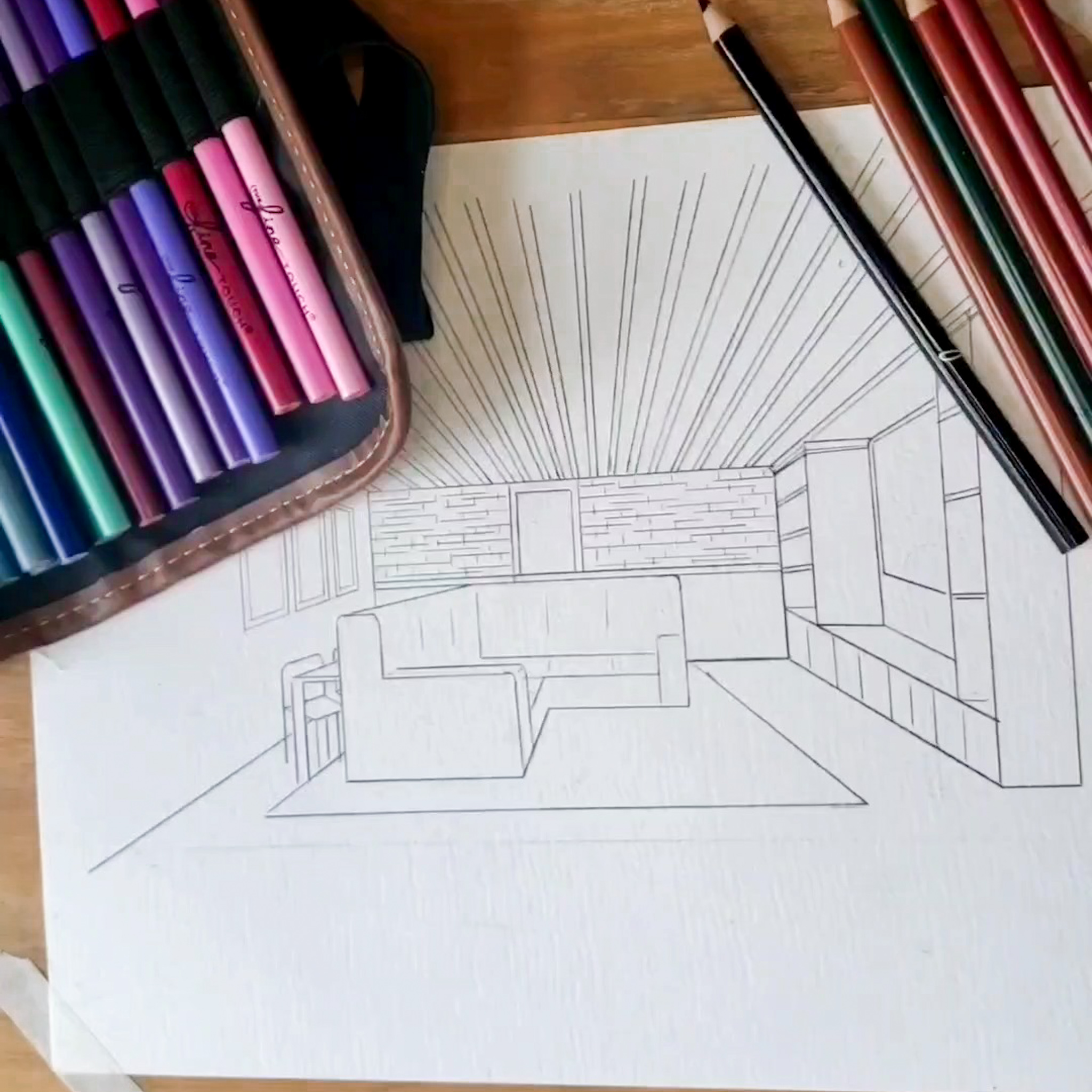
Our kitchen was quite a site to see when we first moved in. There actually was nothing wrong with it, it just wasn’t our style. Which for me meant it was a blank slate to do what I want with. The general footprint works perfectly, it just needs some cosmetic modifications. So I did what I recommend everyone who asks my help in figuring out their style to do. I took to Pinterest and Instagram to search for inspiration and what I’m drawn to. Would you like to hear more about that process? Follow me on Instagram and let’s chat about it.
Below are 10 photos that I’ve looked at countless times. Envisioning them in my space, considering the functionality and the ascetic they would bring to out home. Let’s go through them together, then in the next post I’ll show you the progress we’ve made so far.


I knew I wanted a custom hood vent for over our range. I appreciate that you can turn something that was once purely functional into a statement pieces that is part of the design of your home. I toggled back and forth between these two style for a while until I decided I wanted to marry the two of them.
I love the natural wood tone of the first one and the warmth it brings to the room. I also loved the pop of color and the WOW factor of the blue/grey one. So where we landed was to do the structure of the cream and wood one, but to add the blue/grey color in place of the cream.
I love the corbels on either side of the hood vent, but our ceilings are much lower than theirs. I felt it could feel a little claustrophobic since our hood was going to have to sit slightly lowers than theirs to have the proper proportions.


What drew me to these two photos was the style of the lower cabinets, the cream/mushroom color, and the hardware. I think the inset style cabinet has a timeless look like a piece of furniture, not just a kitchen cabinet. The square shaker style is also more of a causal less formal style which is exactly what we’re going for in our home. A casual look tends to feel more homey and can be more welcoming to guests. Pair that with brass hardware and it elevates the look just the perfect amount. Like a messy bun with a cute pair of earrings, it’s all about balance.


These photos look slightly similar to the last two, but the thing that I noticed here was the millwork. I love great woodwork, trim, and moulding. I also really love wood treatment on walls. So our plan is to do vertical v-board or tongue and grove around the kitchen. Then we’ll finish off the top with trim work similar to that second photo. I think the layers of trim around the window bring so much character to a home a would love to be able to do something similar in our house.

I’m trying to scheme and come up with a creative way to get a faux led glass look in our kitchen in the same design as the grids in this kitchen. I feel like led glass windows are so unique and beautiful. I love the idea of the detail on the top pane and nothing on the bottom pane. We have a great view of the pond behind our home and I’d like to keep a clear view of that.

Everybody loves a good kitchen island! Currently our kitchen does have an island but it’s not centered to the space, the shape in wonky and has different levels, and it’s just not large enough. The kids want to sit there and chat while I’m working in the kitchen but it’s barley 2 feet deep which isn’t much room. I love Liz’s giant store counter turned kitchen island. It has so much space to gather and created delicious meals and treats. I also love the warmth that the natural wood tone brings to the space to make it feel extra cozy and inviting.

This is a screenshot I took from Instagram. I can’t remember whose account this was from, but it was exactly what I was picturing in my minds eye for a particular wall in our kitchen. I affectionately call it the wall of doors. Within about 10 feet of space we have three doors (trash closet, food pantry, appliance pantry) and it feels visually overwhelming. My thought was to wrap the vertical board around the entire room going over top of the doors to make them hidden like in this photo. It would calm the visual overwhelm, but allow us to keep the functional space we need.
Pinterest and Instagram can be such powerful tools when it comes to creating visuals for what you’re picturing in your mind. You can also use them to collect images that you love to find the common denominator of your personal style.


What do you think?